Spareness. Simplicity. A brand with a minimalist voice gets straight to the point. It is created through what it lacks, rather than what it has.
Deciem, a self proclaimed “abnormal beauty brand,” has a strong minimalist voice. For the purposes of this entry, we’re gonna look past the fact that it is the umbrella company for six other beauty brands, which is arguably the opposite of minimalist.
Visually, minimalist brands lack distraction. Photos have strong focal points. Layouts replace the flashy and dynamic with the clean and concise. Color use is consistent with minimal variability. Fonts tend to be sans serif because minimalists don’t even want their letters to have anything extra.
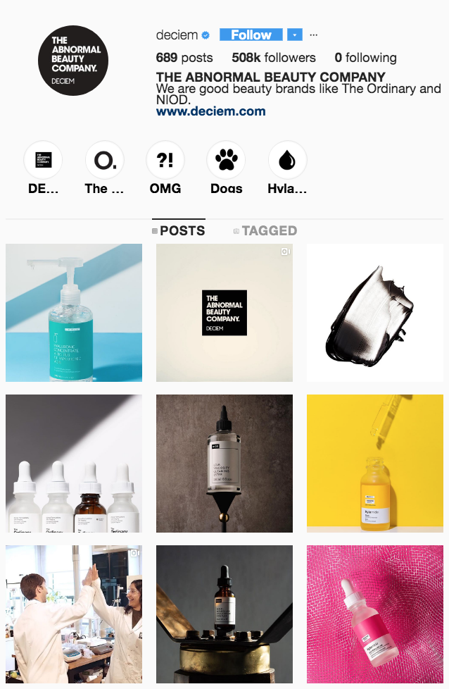
Take Deciem’s Instagram feed for instance. A product is the clear focus of each photo. Backdrops have minimal if any design, and palettes remain relatively monochromatic – a yellow package on a yellow background, white bottles on a black and white background.
A minimalist brand’s copy lacks fluff. Every sentence serves a purpose and that purpose is clear. The text is also chock. full. of. periods. That’s because short, declarative sentences dominate the text.
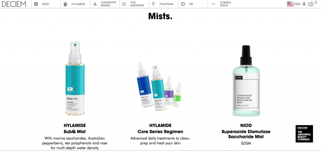
Above is Deciem’s website. Notice the period in the header. See the blank background that pictured products seem to just hang in, and the clean lines that separate tabs. Spot the preponderance of sans serif text. Even the product names lack any fluff. They are called exactly what ingredients are inside them.
Brands with minimalist voices may seem simple, but can actually be incredibly difficult to develop and maintain. They can’t retain popularity through bright colors and catchy names. Instead, they must prove through substance that their products or services are worth experiencing.