Every group has the one friend you describe as “quirky” (and if you don’t, that means it’s probably you).
Nowadays it’s synonymous with alternative or eccentric. Quirks emphasize our humanity — we’re not perfect nor do we function in the exact same way as the person next to us. In the same way, quirky brands thrive off of making it known that its an authentic brand run by real people.
How do people talk? Are they always grammatically correct? Do they use slang? Do their words sometimes eject from their mouth in a discombobulated, stunted manner that can only be described as word vomit? Ok, maybe the last one is just me, but you get the picture. The copy that quirky brands produce resembles how humans actually speak to each other. It’s conversational, has a pension for tangents, and sometimes colors outside the lines of “professional writing.” Words aren’t just used to communicate information, but to collectively create a feeling.
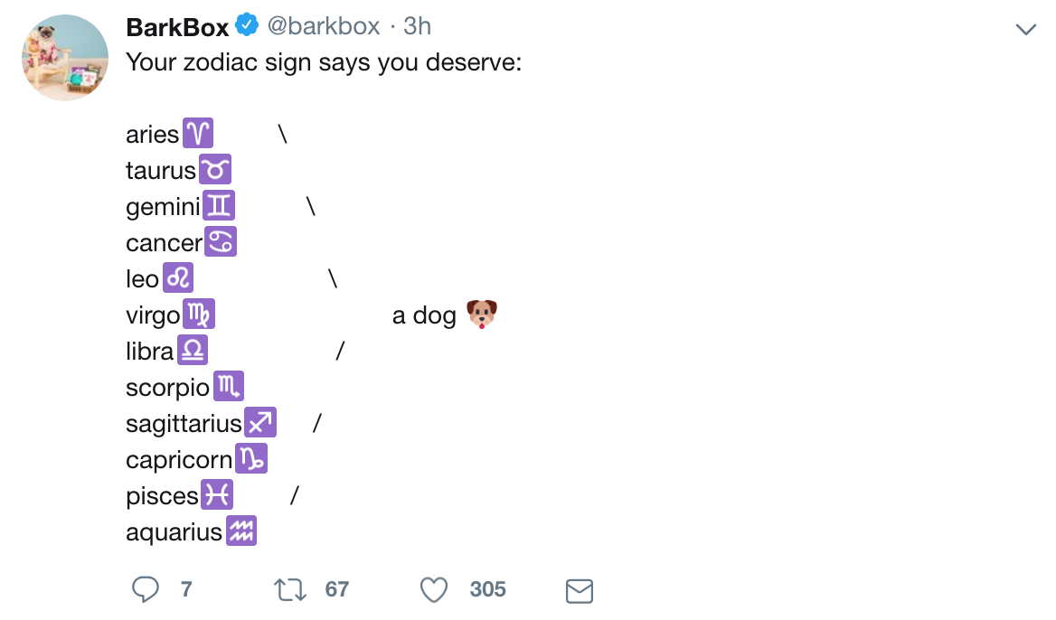
Take Barkbox for example. Their twitter, which relies on text to convey voice, with the exception of some pictures and emojis, definitely comes off as quirky. Check out their most recent tweet, pictured to the right.
This comical take on a popular social media trend is hardly a conventional use of social media for business marketing. But it’s playful and mimics copy that individual twitter users produce. Are the words conveying information to its audience? No, not anything important at least. But because of that, the tweet succeeds in constructing and supporting the brand’s alternative, quirky voice.
Now close your eyes and pull from the recesses of your mind the image of a “quirky” room. I envision a white staircase with an emerald carpet runner, all back splashed by black polka dotted wallpaper. Maybe off to the side there’s an iron side table underneath a fringed green lamp. Undoubtedly, the room you imagined is completely different (and if not – freaky). But what remains consistent is that we conjured up a room that defies or expectation of what a normal room looks like. Similarly, brands with quirky voices present drastically different images in totally different ways, but what ties them together is a nonconformity to expectations. Pictures tend to be personable to their audience, and of course, have a little fun!
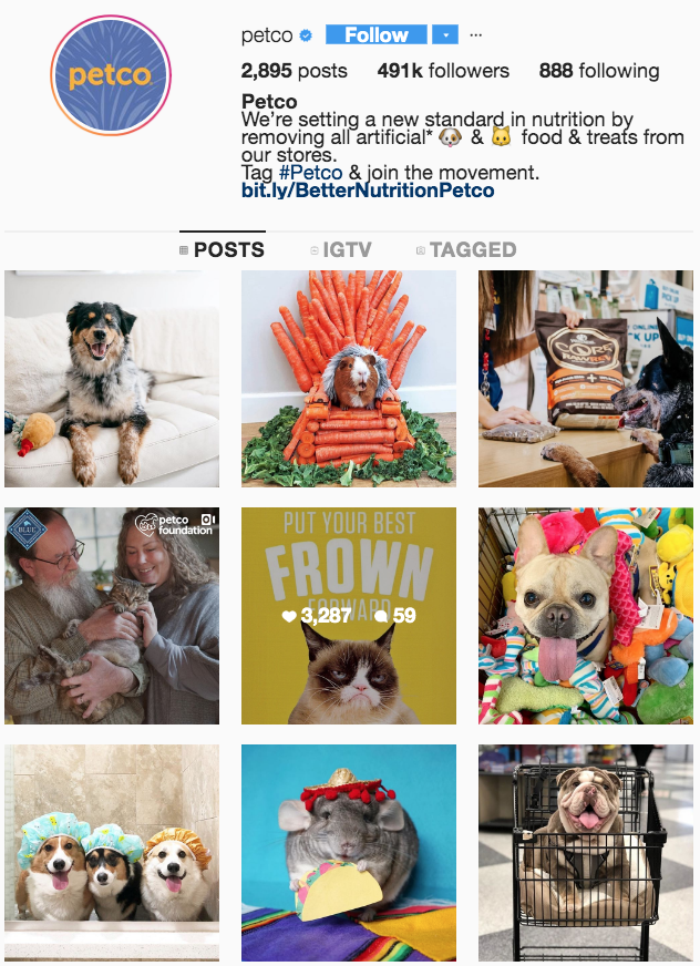
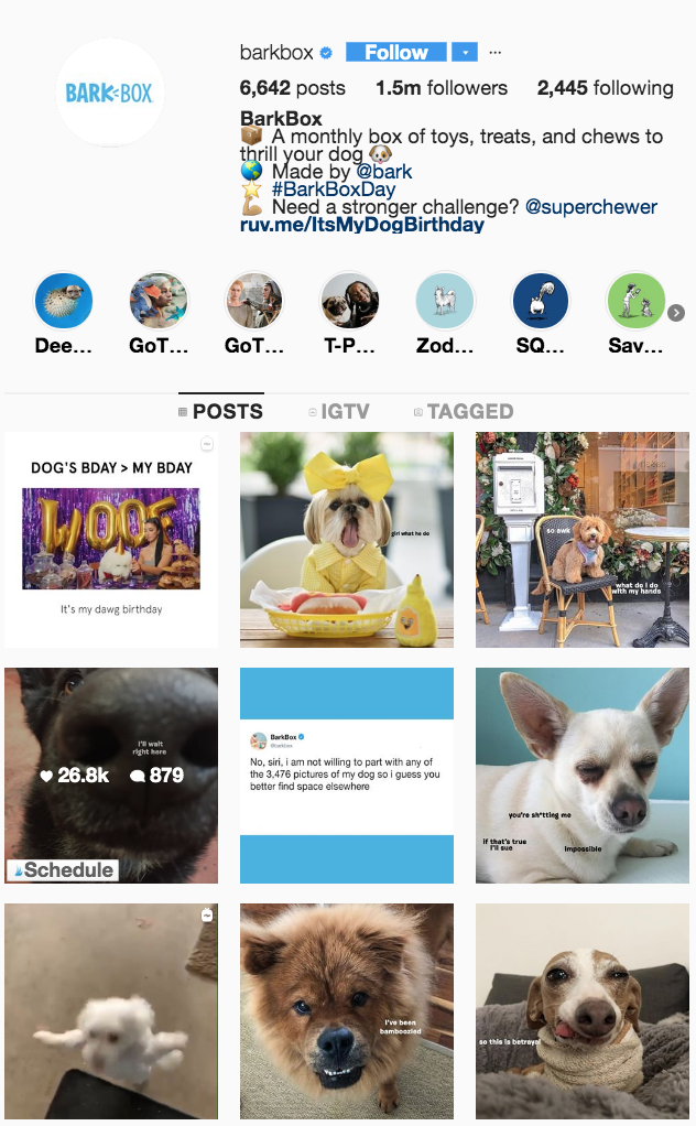
Let’s compare Bark Box’s Instagram feed with the feed of the more conventional pet brand, Petco, both pictured below. Bark Box features a lot of memes, a lot of dogs in funny costumes, and even some screen shots of the company’s tweets. It’s unique, approachable, and not what you’d expect from a company social media page. On the other hand, the pictures featured on Petco’s Instagram are more expected. While still playful and very cute, the photos are more professional, the branding is more obvious, and the voice comes off more mainstream than Bark Box’s.
Ok, now go back to the room you conjured up. The overall impression is “quirky” because the individual pieces work together create it. It’s all in the details. A brand voice is created in the same way through design choices like font and layout. And while these aspects also vary across brands, a quirky brand is unlikely to stick to a strict, Times New Roman, left to right, structured form. Fonts lean a little more towards free form, and the line between copy and images isn’t always so definitive.
Does Bark Box follow these general guidelines for quirkiness? You bet your tail it does! First, let’s take a peak at the logo, pictured below.

The font uses a sans serif font called Apercu – hardly earth shattering. However, the designers made some change to make the font more unique. The letters aren’t the same height, creating the look that the words could be handwritten with a marker. The two little lines make it look like the k in bark is barking. So while this isn’t the most off the wall logo, it definitely is more alternative than the logo of our dear friend, Petco.
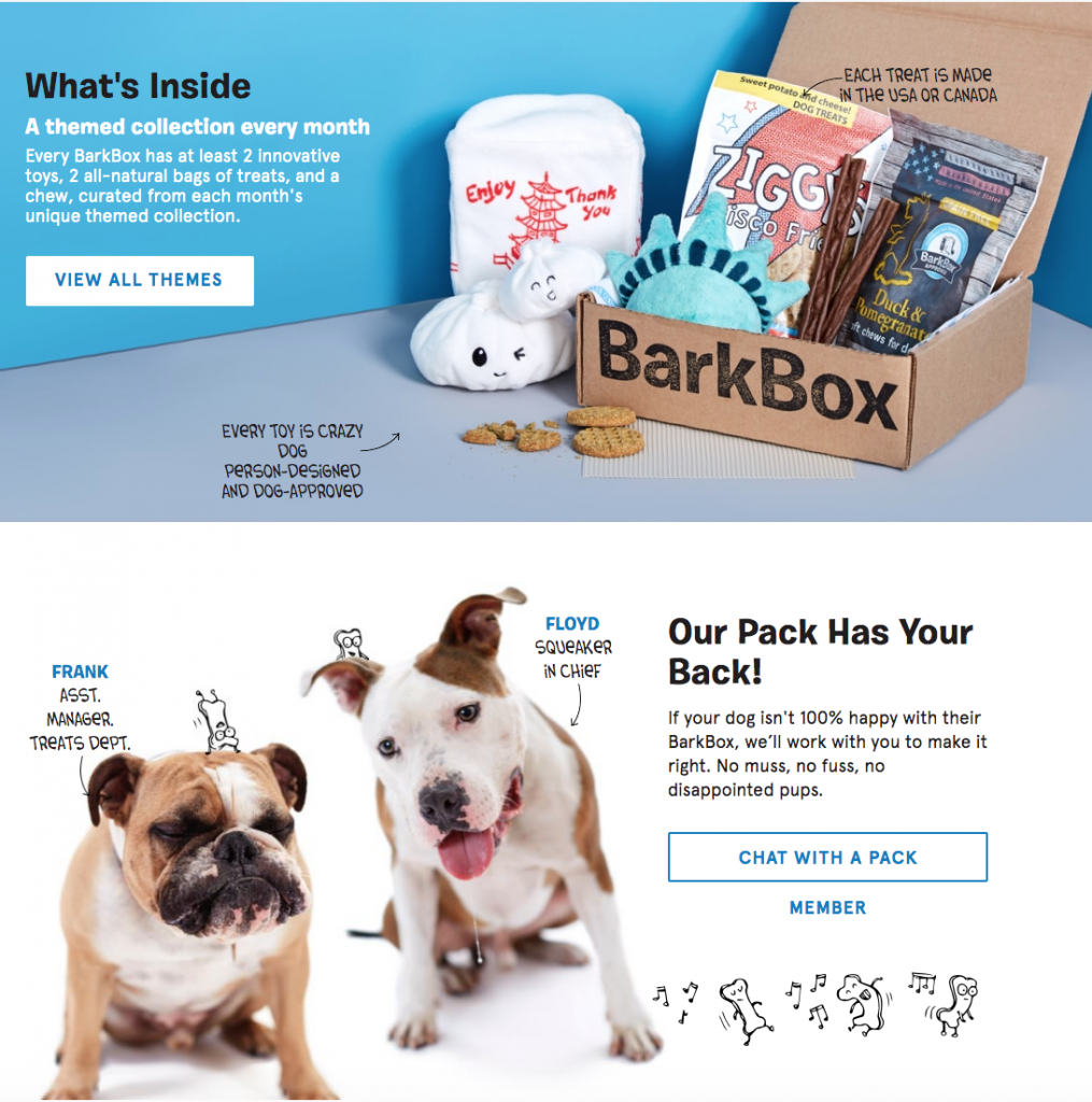
To see more design elements, check out the website, pictured to the right. Text and animations freely interact with photographs in a way that gives the impression that someone printed out pictures and proceeded to draw all over them.
Fun Fact: The “handwritten” text appears in a font called Coverly, a font that Dave Coverly uses in his famous comics.
